When averages stop helping: realizing you don’t know where the days go
You probably have a dashboard that says “average time to close” is 32 days, maybe even trending down. Then a branch calls about a borrower at day 19 with no clear next step, while another file sails through in 8. The average doesn’t help you explain either one, and it doesn’t tell you what to fix on Monday.
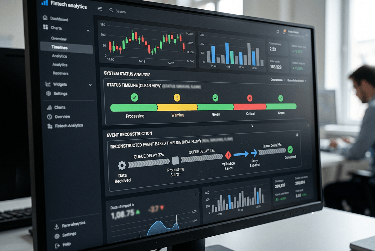
That’s usually the moment you realize you can’t reconstruct where the days go. Pieces of the story live in the LOS, imaging, core, email, and someone’s checklist. Pulling it together by hand burns hours and still turns into arguments about whose timestamps “count.”
Until you can rebuild the real path a loan takes, cycle-time work stays guesswork—and hard to defend when leadership asks for proof.
What counts as the ‘loan journey’ when it spans LOS, imaging, core, and email?
Start by choosing one borrower-facing clock and stick to it. For many shops, that’s “application received” to “funded/boarded,” with a clear rule for withdrawals and denials. Then decide what systems are authoritative for each milestone: LOS for status moves, imaging for document intake/completeness, core for booking, and email only when it triggers a real decision (like an exception approval).
The hard part is that email and checklists rarely have clean timestamps, so you’ll need proxies (ticket created, task completed, exception flag set) and you’ll miss some work. That’s okay—if the events you pick can be defended, you can move on to picking the ones that tell the truth.
You can’t fix what you can’t reconstruct: choosing the events that tell the truth
The events you pick can be defended when they line up with what people actually do to move a file forward. Most teams start with “status changed” events in the LOS, then wonder why the timeline looks clean while everyone still feels buried. That’s because a status move often happens after the work, not when the work starts or when the file becomes eligible for the next step.
Choose events that mark a real state change: “conditions requested,” “all conditions received,” “submitted to underwriting,” “decision posted,” “doc package sent,” “docs returned complete,” “clear to close,” “funded,” “boarded.” If you can, pair each “done” event with an “arrived/ready” event so you can separate waiting from doing. Example: “all docs received” to “submitted to underwriting” is usually a queue or prioritization problem, not an underwriter speed problem.
You’ll hit gaps. Imaging might only show “scanned,” not “reviewed,” and exception approvals in email won’t timestamp cleanly. Don’t paper over that—flag it, and use one proxy consistently (task created, condition cleared, exception code set) so the reconstructed path is credible before you start tackling the messy loops.
The moment the map looks wrong—handling variants, rework loops, and ‘shadow’ work
Those messy loops are usually where your “as-is” map starts to look wrong: the same file seems to bounce backward, repeat steps, or jump ahead with no recorded trigger. A clean straight-through path exists, but it’s often the minority. Most delay hides in variants—missing paystubs, appraisal disputes, title issues, exception pricing—and the rework they create.
When you see a step repeat (“conditions requested” happens twice, “doc package sent” shows up again), don’t delete it as noise. Treat it as a loop and name it. Then tag what caused it using the best signal you have: condition type, exception code, document category, “resend” task, or a reopened status. The goal isn’t perfect detail; it’s to separate “normal path” from “repeat work” so you can quantify how often each loop happens and how long it adds.
Shadow work is the other reason the map looks broken: calls, side emails, spreadsheets, and “quick checks” that never hit the LOS. You won’t capture all of it, and that’s a cost you have to accept. What you can do is spot where shadow work clusters—long gaps between “ready” and “submitted,” or between “docs returned” and “clear to close”—and use those gaps to split touch time from waiting time.
Where is time actually lost: separating touch time from queue time and handoff delay
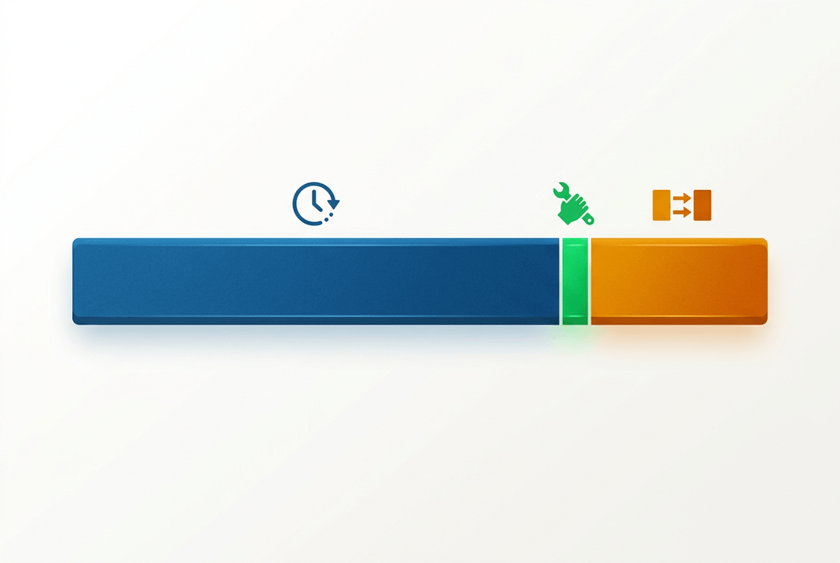
Those long gaps are where teams argue about “speed” while the borrower just sees days. A file can sit “ready for underwriting” for 36 hours because it’s in a worklist, then take 22 minutes to actually underwrite. If you don’t split waiting from doing, you’ll pressure the underwriters, miss the queue, and nothing changes.
Start by defining touch time as the minutes between a “work started” and “work completed” signal, even if it’s a proxy (task opened/closed, condition review started/cleared, doc package generated/sent). Everything between “ready” and “work started” is queue time. Everything between “work completed” and the next team’s “work started” is handoff delay. On a real timeline, that might look like: docs complete at 2:10, underwriting starts at 9:05 next day (queue), decision posted at 9:27 (touch), conditions cleared at 3:40, closing starts two days later (handoff).
The limitation is you won’t always have clean “start” events, and some people batch updates at day’s end. Use the same proxy everywhere and you can still rank where time leaks: the biggest queues, the slowest handoffs, and the few steps with truly high touch time—then decide which one you can fix and defend.
Picking the short list of fixes you can defend to leadership (and auditors)
“Fix and defend” usually means you can explain the delay in plain terms, show the evidence trail, and point to a control-friendly change. Start by taking your top three time leaks and forcing a simple question: if you cut this in half, does the borrower actually feel it? A two-day queue before underwriting usually beats shaving five minutes of touch time inside underwriting.
For each candidate fix, write it as an if-then with a measurable target: if “docs returned complete” to “clear to close” is a 48-hour handoff, then commit to a same-day handoff for complete packages, with an agreed cutoff time. Tie it to an event pair you already trust so an auditor can trace the before/after without debate.
The hard part is change cost. Worklist rules, exception routing, and doc intake standards cross teams, and “quick wins” can stall in governance. Keep the list short, make owners explicit, and set up the one chart you’ll use to prove it sticks.
Proving impact without a new reporting swamp: how you keep the gains visible
That one chart works when it stays tied to the event pairs you already trust. Keep a single “before/after” view for each fix: median and 80th-percentile time from Event A to Event B, plus volume and loop rate (how often the step repeats). Example: “docs returned complete → clear to close” shows 2.1 days at the 80th percentile last quarter; target is same-day for packages received by 2 p.m., with the loop rate for “doc package resent” held flat.
Resist building a new dashboard universe. Automate a weekly pull from the same sources, freeze the definitions, and publish a one-page scorecard with owner names and exception notes for weeks when volume spikes or a system outage distorts timestamps. The constraint is real: if your proxies change midstream (new task codes, new status rules), your trend breaks. Treat definition changes like policy changes—document them, date-stamp them, and keep the chart readable enough that leadership can’t ignore it.